In this last installment of the 4-part miniseries, Julie Campbell, AIA, one of the principal Architects here at CTA, offers additional insights and suggestions for embracing and enhancing the Mid-Century Modern Architectural Style.
The topic of today’s post is: BATH REMODELS and STORAGE SOLUTIONS – it’s personal.
We’ve talked about Mid-Century history, design elements worth cherishing, exteriors, interiors, and the most used room in the house, the kitchen. This issue, we will tackle the more intimate areas of the remodeled home: Bathrooms and… storage space.
The original bathrooms in houses of the ‘50s and ‘60s are really tiny by today’s standards… And dark! So here are a few tips that can make your bathroom feel more spacious, light-filled and luxurious. The main trick is to keep the space simple. And again, limit your palette of materials and colors.
Bathroom Tip: Keep Bath Cabinets simple and lightweight.
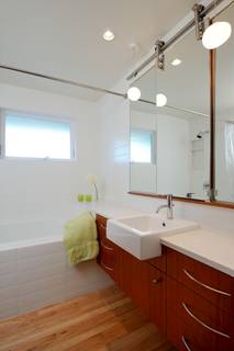
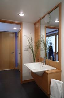
Contemporary “mid-century-modern” cabinets should be flat, without any paneling or fussy details. Trick: Install the vanity 10 – 12” up off the floor so that it has the appearance of floating above the floor; the space will seem much larger. Go even further in by extending the countertop beyond the vanity, that long stretch of counter will really make the room seem expansive. If space is tight, use small-scale plumbing fixtures. Semi-encastre sinks are great space-savers; they require only a 12 or 15” deep vanity cabinet. To increase light in the bathroom, consider putting a large window in the exterior wall of the tub or shower; install a vinyl window unit with frosted glass to ensure against rot and provide visual privacy. The result is a lovely calm, diffuse quality of light in a very personal space!
The photo at left shows a floating vanity, semi-encastre sink and a countertop that continues behind the end of the tub. Note the limited palette. Photo at right also shows a semi-encastre sink, and limited palette, but using more wood throughout.
Storage tip: Built-in Cabinets strategically placed are a wise investment.
Storage is the ongoing battle to be waged in making these homes more functional for today’s world; somehow we all accumulate a lot of stuff! From sentimental tchotchke to that backpack stuffed to the gills with daily necessities, there’s always a call to organize stuff better. Our strategy is to design built-in cabinetry wherever there’s an opportunity, especially at key mess areas like entry zones and kitchen junk corners. Custom designed cabinetry that maximizes storage space in a range of types (i.e. drawers, shelves, cubbies, hooks, etc…) goes a long way in helping you keep the daily drop & clutter organized and in its proper place. Added benefit: Custom cabinetry also enhances the overall continuity and architectural harmony; after all, Mid-Century Modern is DEFINED by clean geometric forms, so we just can’t go muddling it up with clutter, even if it is our FAVORITE clutter.
So as a wrap up to our four-part series, keep in mind CTA’s Five Magic Points as you consider your Mid-Century remodel project:
5 GOALS FOR A SUCCESSFUL MID-CENTURY REMODEL:
1. Think “SIMPLIFY!”
2. Remove superfluous ornament, especially anything from other styles and eras.
3. Express the structure.
4. Open up rooms with space and light… create larger social areas and connect to the outside.
5. Limit your palette of materials and colors to enhance continuity and spaciousness throughout.
And, of course, if you would like help with your Mid-Century Modern project, we’d be delighted to meet you at your house for a consultation!
Categories:
Categories:
Tags:


