 Small Space, Big Change – CTA Builders Featured in Seattle Met Magazine
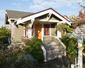
Craftsman Remodel – CTA Design Builders are thrilled that our Craftsman Charmer project (Project Link) has been featured in the August edition of Seattle Met magazine! It was also an AIA Future Shack competition entry because we believe we can make these older, classic small homes, adaptable to today’s lifestyle by adding on in intelligent ways, and with minimal physical impact. We can create new inside and new outside spaces that not only work, but also respect the original Craftsman Style architecture. These spaces are a pleasure to be in and the construction is a pleasure to look at.
Karl Keff and Kathy Salmonson are committed to living small, but after 17 years sharing 800 square feet, a single bathroom, two bedrooms (“one and a half, really”), and minuscule closets, the couple wanted a little more space. Not a lot—just a master bedroom with its own bath and larger closets. However adding those things to their 1917 Craftsman home in West Seattle without changing the character of the house proved more challenging than they initially imagined.
One option was to lift the house to expand the partially finished basement, but, as Karl remembers one builder’s observation, “A basement is always a basement.” Others suggested adding a second story, a process requiring costly foundation and structural work to support the additional weight. One architect advised putting what Karl calls “a big box” in their backyard.
And everyone seemed to want to give them more space than they needed, even though they were adamant about maintaining the cottage’s scale and integrity.
Determined to find someone with experience working on homes like theirs, Karl browsed the AIA Seattle website until the work of CTA Design Builders caught his eye: The firm had done several renovations of Craftsman homes, though most were larger projects. “I felt like they had an understanding [of what we wanted to do] and were interested in craftsmanship,” Karl says.
When Karl and Kathy met with architect Julie Campbell of CTA, she proposed an addition that—finally—made sense: Put the master suite on top of the adjacent garage, making an L-shaped structure, and enclose the stairway at one side of the home’s existing (tiny) second bedroom.
The garage didn’t need a new foundation, but presented other challenges. “Since the lot line was so close to the garage, we couldn’t put the second story directly on top of it,” explains the architect. Instead, the addition is offset from the original footprint, creating an overhang where Campbell tucked a sauna, a potting shed, and a covered porch. “That enabled us to have this rich, architectural interface between the garage and the backyard,” she says. Another benefit: Adding the bedroom on top of the garage enhanced the L shape that now makes the back patio space feel more like an outdoor room.
Following her clients’ wishes—and her own instincts—about matching the charm of the couple’s home, Campbell designed the master suite with Mission-style oak built-ins, Craftsman details, and banks of windows. She chose calming colors for the bedroom and bath to make the space feel like a retreat.
The entire project added only about 400 square feet to Karl and Kathy’s modestly sized home, but it gave them a light-filled master suite with high ceilings and a skylight above the shower, a built-in dresser, and two new closets—plus one with a washer and dryer. It’s a remodel that transforms without overwhelming.”
Please read the original Seattle Met article by clicking here: http://www.seattlemet.com/home-and-garden/home-remodel/articles/a-west-seattle-remodel-adds-a-new-master-suite-august-2012
Categories:
Categories:
Tags:
Tags:

