In our first article in this series, we offered a brief history of how Craftsman or Bungalow style architecture came into such popularity in the late 1800’s Industrial Age. Here in Seattle, as elsewhere, we continue to witness how this unique, nature-influenced style never seems to grow old or dated; there’s an inherent timeless appeal to these structures, and this appreciation is gaining popularity again as our daily lives grow ever more technology-filled .
In this article, we’ll dig into the specific architectural elements of Craftsman and Bungalow styles, focusing on exterior elements and explaining the reasoning behind these features. If you’re planning to build a new Craftsman style house, or remodel an existing, it’s critical to really understand the Craftsman philosophy and let it guide your design; if not, you risk missing the mark. As architects, we take this challenge very seriously and work hard to incorporate the essential elements into our Craftsman projects, staying true to the intention behind the style.
As I mentioned in Part 1, Craftsman style was born out of discontent with an alienating modern world; it was a resurrection of the long-held values of handcraftsmanship in reaction to the dehumanizing effect of factory life and industrial labor. The design of homes focused on creating cozy retreats nestled into natural landscapes, welcoming you into a restive sanctuary, rich with natural materials and beautiful details, fixtures and furnishings.
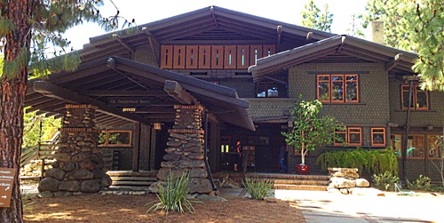
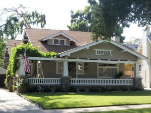
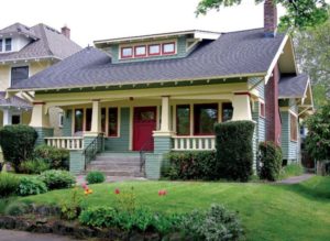
To begin with, the most prominent element of a Craftsman home is the roof. Without fail, every traditional Craftsman home has a prominent low pitch roof with exaggerated overhangs! The low-angle pitch is key. Look at contemporary spec houses that purport to be Craftsman style: most have steeper roof pitches with perky dormers, and just don’t have a true craftsman look about them. Most historic old dwellings had a single floor with a low slung roof form, as the entire philosophy emphasized simplicity over indulgence. This home style was very popular (and affordable!) among working class folk, so homes tended to be modest in scale.
Wealthier homes often had 2 floors, but the architect worked to keep the upper roofs as low as possible, using lower shed roofs below to minimize the impact of a 2-story wall; the whole intention being to keep the house looking like it snuggles into the landscape, versus sitting perched up on top of the ground.
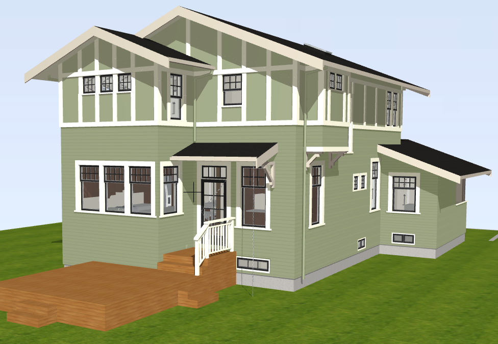
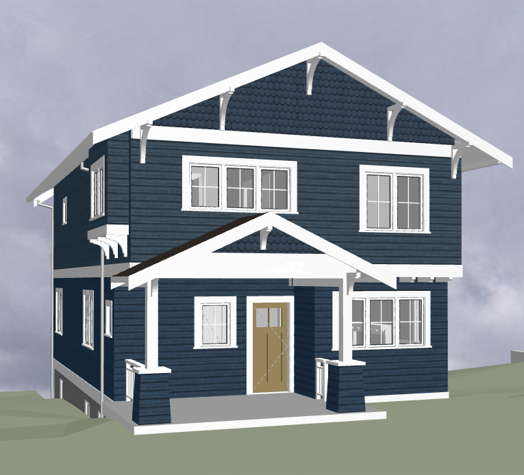
To illustrate how these architectural elements can inform new construction, see our current Craftsman projects below.
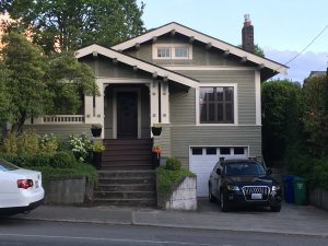
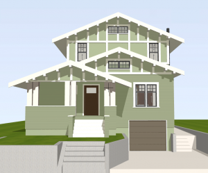
In the left photo above, see our owner’s existing 1913 Craftsman home – a single story house with some lovely Craftsman features, especially the covered porch with chunky, detailed posts. We are adding a second story addition (right image), so in an effort to keep the house from becoming too massive with its new second floor, we’ve stepped the upper wall back from the front of the house, and keeping the two lower existing roofs intact so that the broad low-pitch roof forms step up and back from the street. Note the big overhangs, brackets, divided light windows, continuation of original siding patterns.
Also on our boards and under construction: a totally new 2-story, Craftsman-inspired home. Although large, note the roof with large overhangs and Craftsman-detailed brackets at roofs and bump-out bay window. Also included is a big covered porch, and adjacent overhanging second floor with corbel details to break up the mass of the wall.
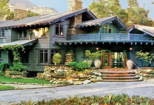
Below is a photo of a classic old, 2-story Greene & Greene home in Pasadena CA. Note all the roof forms stepping up to camouflage the height of the structure, enabling it to seem nestled into the landscape.
Ground forms and site-work also work to strengthen this effect; rockeries stepping up to the house, stepped patios, mounded planting beds all create a naturalistic landscape out of which the house seems to emerge. In the photo below, even the chimney is built out of the same rocks that form the entry terrace walls, as if the landscape is within the house itself!
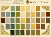
Other attributes of Craftsman exteriors include wood siding that offers textural interest: shakes or narrow horizontal boards, or a combination of types. Often the overhang “tails” are exposed (see above photo) to add textural interest. Wooden roof brackets are common and add visual interest. Almost all Craftsman homes have front porches that are usually covered by big roof overhangs, enhancing a feeling of indoor/outdoor connectedness. Colours are usually earthy and natural hues.
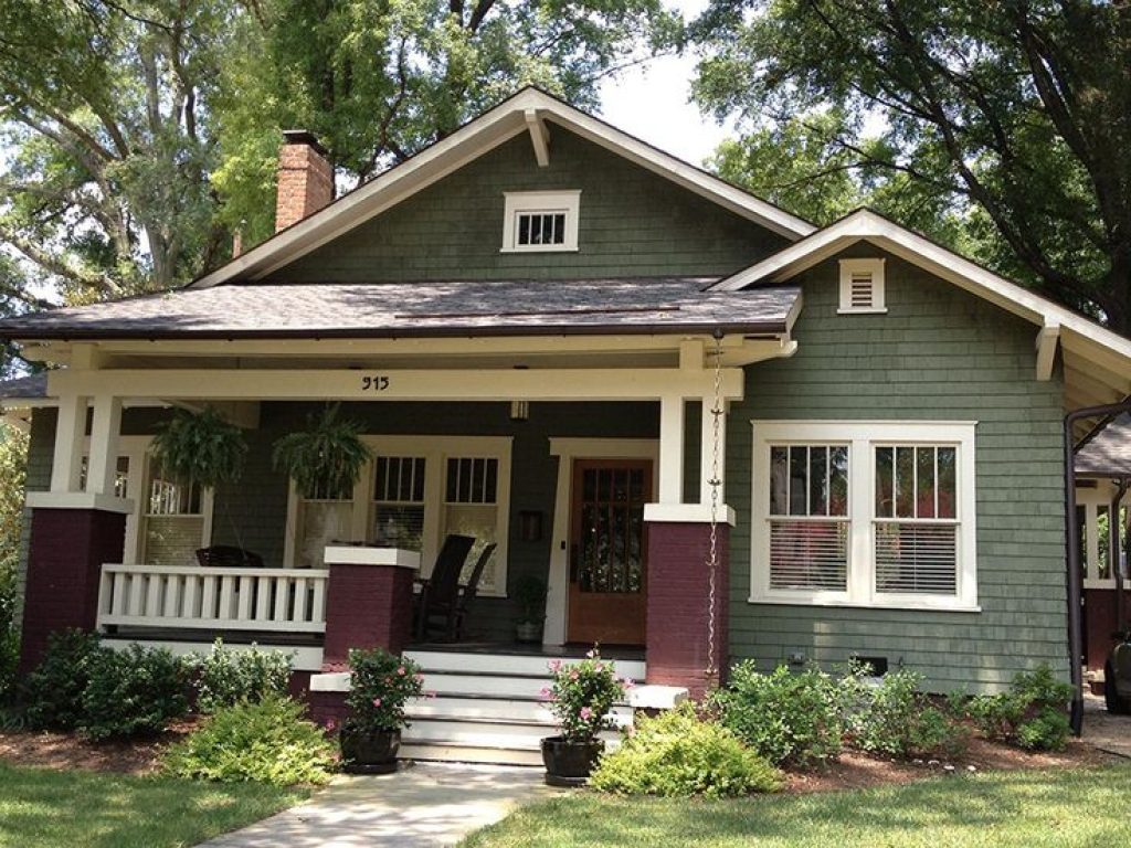
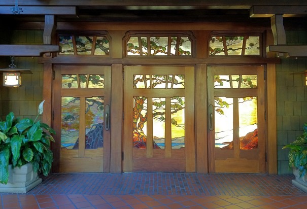
Windows always include divided lights in some repetitive pattern – stained glass in key areas is common.
The Tiffany studios were in their heyday during the time Greene & Greene homes were being built in California; the Gamble House has extraordinary examples of this:
As you can begin to understand, common to all these features is an emphasis on the natural world: natural, local materials, low, earth-bound architectural forms, colours taken from the landscape, strong connection between inside & outside; all this comes together to help the dwelling feel as if it’s connected to the earth in a timeless fashion.
Next up: Part 3 will focus on how Craftsman INTERIORS achieve this same goal: home design that provides connection with nature and sustenance to the soul. That’s an architecture that suits any era!
Categories:
Categories:
Tags:


