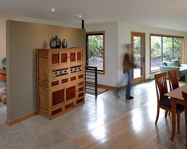
Part 2 of the series featuring: Julie Campbell, one of the Architects at CTA Design Builders Inc., specializing in Mid-Century design and architectural history. She has given lectures on this topic around the region. This series of four articles will discuss strategies for remodeling your Mid-Century home in ways that respect the original architectural intention, capture the contemporary appreciation for Mid-Century design and integrate those classic elements with today’s modern lifestyle. With a little contemporizing and a healthy respect for Mid-Century style, you can give your home another 50 great years!
Remodeling Strategies for Mid-Century INTERIORS
Previously, we discussed how Mid-Century homes are enjoying a great surge of renewed appreciation these days; many home-owners are remodeling in a very contemporary manner, but keeping the mid-century “bones” intact for their inherent architectural appeal. This is the second article of four that will discuss strategies for remodeling a Mid-Century home. So what is it about these houses that made them so popular in the ‘50s and ‘60s, and now again today?! Well, back then for the first time in housing design, the floor plan was “opened up.” Interiors were suddenly more spacious and allowed for a completely different way of inhabiting a home. No longer did separate enclosed rooms divide the house up into small spaces; living, dining and kitchen areas were more connected, which encouraged a more communal family lifestyle. That was a HUGE shift that had repercussions in many other aspects of our culture, like cooking becoming entertainment! Other features that emerged – and stayed… Large windows allowing for more light in and great views out;
- Simple palette of materials + lack of ornamentation = less maintenance and more personalization
- Less expensive building details meant the cost per-square-foot of a home was cheaper, so you could do more with less.
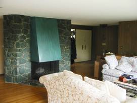
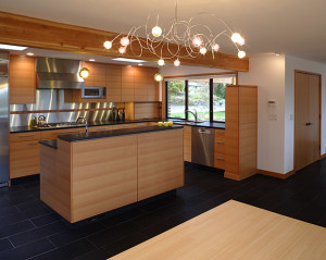
The same benefits are being rediscovered today, but with a 21st century twist! In our last 10 years of remodeling mid-century homes, the design challenges we receive from our clients are similar in nature: kitchens are still too small, not enough bathrooms, the front entry is narrow and tight, and never, ever enough storage. A typical strategy would begin with removing a wall or two to open a kitchen up to the living and dining area and make it even more of a “great room.” Enlarging the kitchen and incorporating an island or bar counter often is all that is necessary. For the most part, Mid-Century houses are well built, so removing a wall or two is often very easily accomplished. Check out this eye-opening transformation with just the removal of a wall:
Before and After
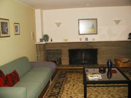
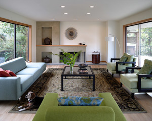
We constantly look for opportunities to add more windows or openings to the outside in an effort to increase connection between indoors and outdoors. And getting more light into the house is always a good thing!
Before and After
In our remodels we strive to simplify the architecture and express the structure wherever possible. We suggest keeping the selection of materials & finishes to a minimum, as this will enhance the feeling of continuity throughout the house. In a house where there is lots of open, contiguous space, this goes for color palettes as well.
Stay tuned for the next episode of Mid-Century Magic: Remodeling Strategies for The Kitchen!
Categories:
Categories:
Tags:


