Part 3 of the series featuring Julie Campbell, one of the Architects at CTA Design Builders Inc., focusing on Mid-Century design and architectural history. She has given lectures on this topic around the region. This series of four articles will discuss strategies for remodeling your Mid-Century home in ways that respect the original architectural intention, capture the contemporary appreciation for Mid-Century design and integrate those classic elements with today’s modern lifestyle. With a little contemporizing and a healthy respect for Mid-Century style, you can give your home another 50 great years!
Remodeling Strategies for Mid-Century Homes: The Kitchen
The first two issues gave some architectural history behind this radically different housing style known as Mid-Century design, and an overview of typical architectural features. We went on to offer suggestions for appropriate exterior and interior improvements. This issue will focus on Kitchens. CTA Design Builders remodels many homes of this style, so we’ve become very familiar with the issues typically encountered, and truly enjoy breathing new life into these classics!
Almost every client comes to us with the same challenge: “Open up the kitchen so it creates a larger family gathering space and becomes the real ‘heart’ of our home!”
A typical strategy is to remove a wall or two to open the kitchen up to the living/dining area and make it even more of a “great room.” As we mentioned earlier, these houses typically are well built, so removing walls is often very easily accomplished. But opening up the kitchen requires a lot of attention to the details…
Problem #1: Open, but not too open. One particular challenge of creating any open “great room” space incorporating the kitchen is how to conceal the reality of kitchen mess, keeping it out of view from the adjacent spaces. We know everyone loves to gather around food prep, but when all that’s left of a lovely evening are the dirty dishes…
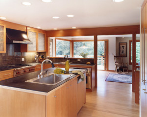
Solution #1: Screening elements. A good trick to achieve view protection against kitchen mess and other “necessarily cluttered working areas” of open space living is to create a screening element. We have found that a raised bar on the living room or dining room side of an island works very well to temporarily hide those dirty dishes.
Problem #2: Space – is this a great room or a bowling alley? Just opening up an area without considering visual and contextual continuity can create a feeling of cavernous uneasiness, not unlike sitting at a bistro table in a warehouse. It is our belief that you should never hear your friends say “oh look, I see where you ripped out that wall.”
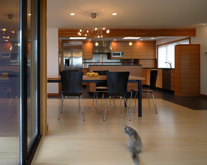
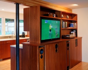
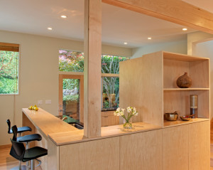
Solution #2: Selective cabinetry for continuity. Cabinetry that is open on one or two sides creates a feeling of some separation from the living-dining area, yet at the same time preserves the feeling of connectedness to the rest of the great room space. As there is so much cabinetry in a kitchen, it helps if other smaller pieces of the same cabinet style are also placed in the living and dining areas, such as a dining credenza, sideboard or window seat. This creates an overall feel of continuity in the larger overall space, filling it with the warmth of wood. And of course, adding windows in the kitchen and wherever else you can enables the now-bigger room to feel lighter, more airy, and better-connected to the outside. Put in doors to a deck – the bigger the better!
Here are some examples:
Look for the raised bar in both these kitchens. The beam above is where a former wall existed. Big new windows or doors to a deck create great light and connection to the outdoors.
These two kitchens incorporate cabinetry that is partially open to living areas, creating a greater degree of screening, but still allowing for a sense of openness and connection. The non-kitchen side of the cabinets is designed for display or media functions on the living area side!
One of the Mid-Century remodel design goals of CTA Design Builders is to simplify the architecture and express the structure wherever possible. We suggest keeping the selection of materials and finishes to a minimum, as this will enhance the feeling of continuity throughout the house.
Next up: CTA Design Builders’ Mid-Century Magic – Bath and Storage Solutions!
Categories:
Categories:
Tags:


