BUZZ AND JULIE GO TO JAPAN
Buzz and I have just arrived in Japan for a 2-week long-anticipated architectural pilgrimage! Having studied and implemented Japanese design principals into our architectural work all these years, we’re here to explore and study the culture, both historic and contemporary, that has led to a design paradigm that we revere. We’ll be spending 4 days in Tokyo, then up into the hills of Takayama where farming folk houses still exist, then down to Kyoto – the cultural heart of Japan. We invite you to join us in our travels through what I hope will be a few interesting blog posts!
We survived the train and metro adventure to our hotel in ASAKUSA – an older Tokyo neighbourhood that isn’t quite as dense and frenetic as some of the other neighbourhoods. We were in awe of the volume of people travelling the subway system at 9:00pm….an eye-opening introduction to a city of 35million people! Those kinds of numbers give us a new perspective into everything we look at from now on.
Entering our hotel room, we are charmed by the entry to our room: a tiny space only 3′ x 3′ where we exchange our shoes for sandals. There is a sliding panel and single step up into our tatami room.
Over the next few days as we travel, we notice that every house we see shares this feature, whether modern or traditional, modest or extravagant. The act of entering and pausing to remove shoes, then stepping up off of the “street” (or elevator hall!), and through a screen, has the effect of leaving the hectic public realm, and entering into the sanctuary of one’s private domain. It’s a wonderful feeling to close that sliding panel to the chaos of 35 million people!
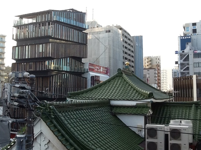
We’ve heard so much about how modern Japan is a place of extreme contrasts. Looking out our hotel window is a snapshot of that notion. Our hotel is next to a very important old temple, with the throbbing city pressing in against it. Across the street is a remarkable new building whose unusual articulated roof lines at each floor recall the ancient 5-storied pagoda up the street. We discover it was designed by one of the new generation of great Japanese architects: Kengo Kuma http://kkaa.co.jp/works/architecture . Exploring the bulding the next day, we start to see firsthand how Japanese design can be so new and exciting, yet still embody traditional roots.

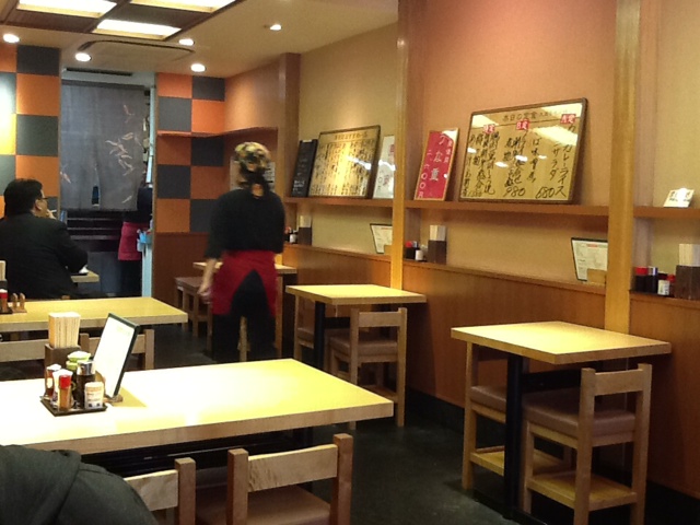
Our visit to a modest street cafe for breakfast is another example of the refined Japanese design sensibility. For such a mundane little place, attention to design is astounding. Notice how a structural system of posts and beams is clearly defined, and a secondary system of panels and screens maintain a serene simplicity that is a welcome retreat from the hectic street outside. Even the simple tables and chairs adhere to the structural layout. And of course the food is incredible!


