
A Great Seattle Architect. Gene Zema’s Lupton Residence: Design Analysis.
Here are further thoughts on design from an analysis of the Lupton Residence! (See our earlier blog posting for an overview and virtual tour.) This is a classic mid-century residence on Mercer Island. The residence was a Seattle Times/AIA House of the Month, and then House of the Year in 1961. For such a modest home by today’s standards, it offers much to learn from!
As Seattle residential architects committed to designing beautiful homes that withstand the follies of style and trends, we continually strive to widen our understanding of what makes for a well-designed house…one that responds appropriately to it’s place, time, and functional requirements! The points below describe how we have analyzed this still-wonderful home, and what we’ve learned from it.
Plan: overall site plan and organizing structural presentation is immediately understandable. The house is one simple rectangle with an adjacent garage. The entry is intuitively found in the space between! Especially with smaller single-family residences, the floor plan should be simple and easy to understand. Immediately.
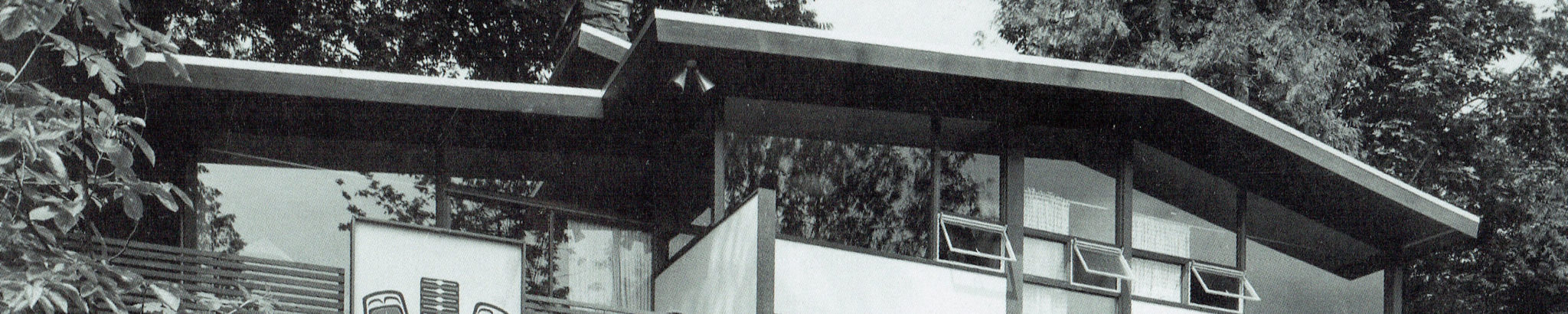
Structure: simple wood structural elements are expressed clearly. Nothing is hidden, rather the pieces and connections are elegant and exposed so that they become the “ornamentation”. In some cases, the structure is exaggerated or celebrated, for example the projection of the beams and supports at the upper and lower roof supports. Especially here in the Northwest, architecture can be very expressive of the wealth of natural materials that are appropriate for use in residential construction.
Roof element: is expressed as a major and powerful element of the overall form. This (very Japanese) characteristic lends an iconic, primal quality to a house: shelter at its most basic. The overhangs are large, especially noticeable at the glazed corner of the living room view where the house seems to reach right out into the garden beyond. It’s the big overhangs that achieve this quality. This creates the inside/outside exchange…that feeling of bringing the outside in that so many people here in the Northwest long for.
Screens: filling in the wall planes of the modular floor plane. These range from opaque walls of white Sheetrock, to wood lattice in varying degrees of openness, to placement of kitchen cabinets overhead that allows one to see around or through. All of this results in creating views into adjacent spaces, creating spatial complexity, and making a small house feel much larger and more complex than it really is!
Floor Plan: is very simple. It’s a rectangle with all living spaces aligned along the view edge. Public spaces downstairs, and private spaces (bedrooms) upstairs. Hard-working spaces like kitchen, bathrooms, closets, utility etc. are located along the back (non-view) edge and under the loft.
What a great house! AND a construction cost of $25k in 1961. Supposedly that translates into about $250k in today’s dollars! Of course you wouldn’t be able to build the house exactly this way now due to energy codes and other code changes; these newer requirements create additional cost. But the overall design is masterful; it’s been a privilege to visit this house and step into the mind of a great local architect!
Pingback: Mid Century Modern gets modern! | CTA Design Builders Blog