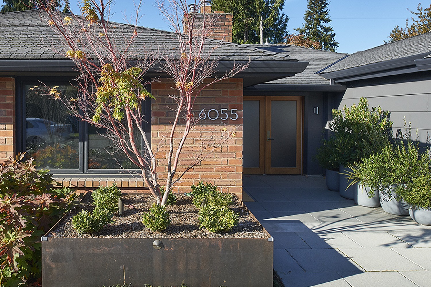
Having lived in this modest mid-century rambler for a few years, the owners had developed a deep love for their very friendly neighborhood – a 60s development of similar one-story brick-faced homes close-in to the city. However as their children came along, so did a growing need for the house to function differently.
As is so common in this earlier style of home, a dark hallway led from the front door past a living and dining room to 2 small bedrooms and a single bathroom on the main floor, and an enclosed stair down to an unfinished daylight basement. An 80s addition allowed for a family room off the kitchen, but created a dark unpleasant area (we call them “beer-can spaces”!) underneath that structure in the back yard. Knowing they did not want to move, they came to us to looking for creative ways to open up the house for more family-friendly living and to add a master bedroom suite.
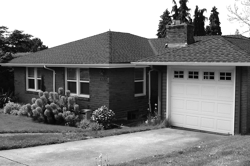
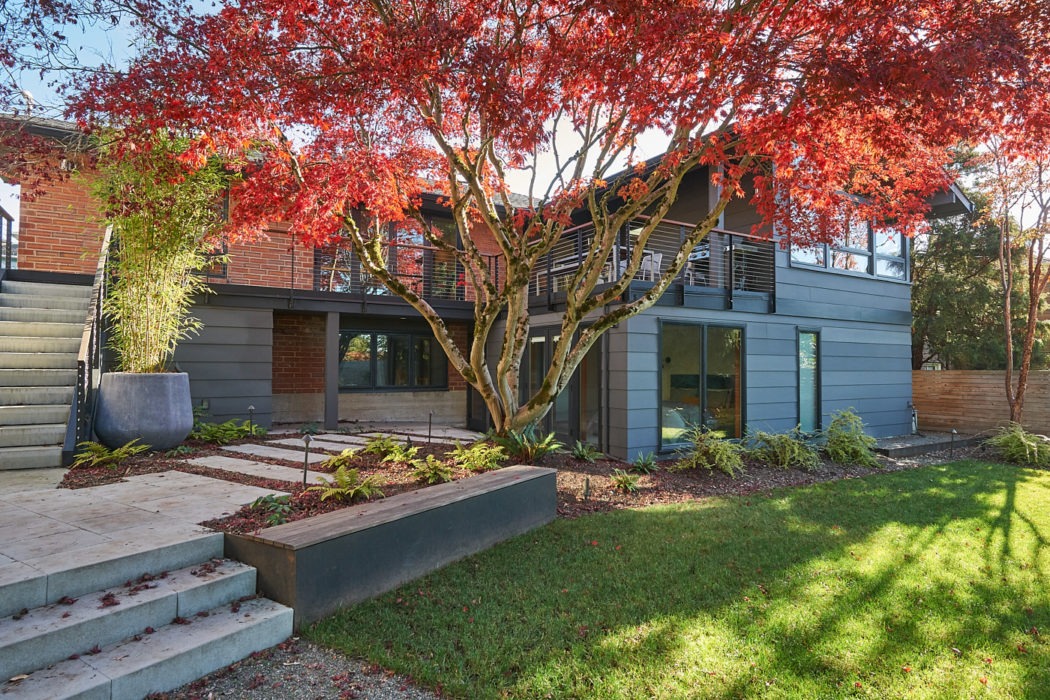
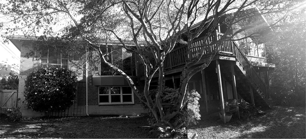
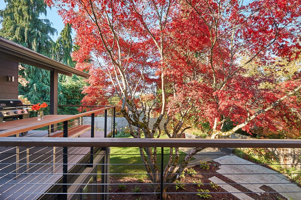
In our assessment of the house and property, we observed how the house felt very closed off from its exterior yards. The front yard had not been improved, but offered great potential for a patio that could make a friendly connection to the neighborhood. The back yard was large, and featured a huge, gorgeous red Japanese Maple tree; developing the outside spaces and connecting them to the interior became a guiding element of our design work.
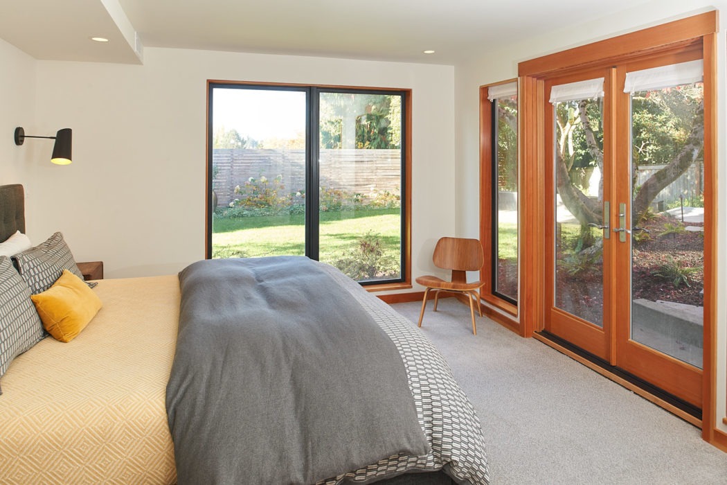
Deciding on how to add the master suite was a little more challenging. Adding a second story was a natural first thought, however the owners were uncertain about this prospect. Many homes in the area have been enlarged over the years, creating an odd mix of very bulky homes amidst the older, smaller mid Century originals. They felt that a pumped-up “new” house was just not who they were! As we considered that beautiful Japanese maple just outside the back basement, we realized it would be the perfect focal point for a master suite tucked under the upper floor addition, creating a rear courtyard that both floors could enjoy. It would also get rid of that beer-can space and resolved the seismic liabilities that addition created!
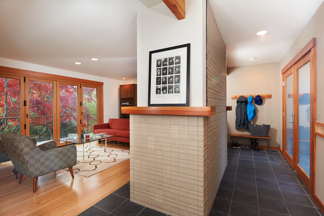
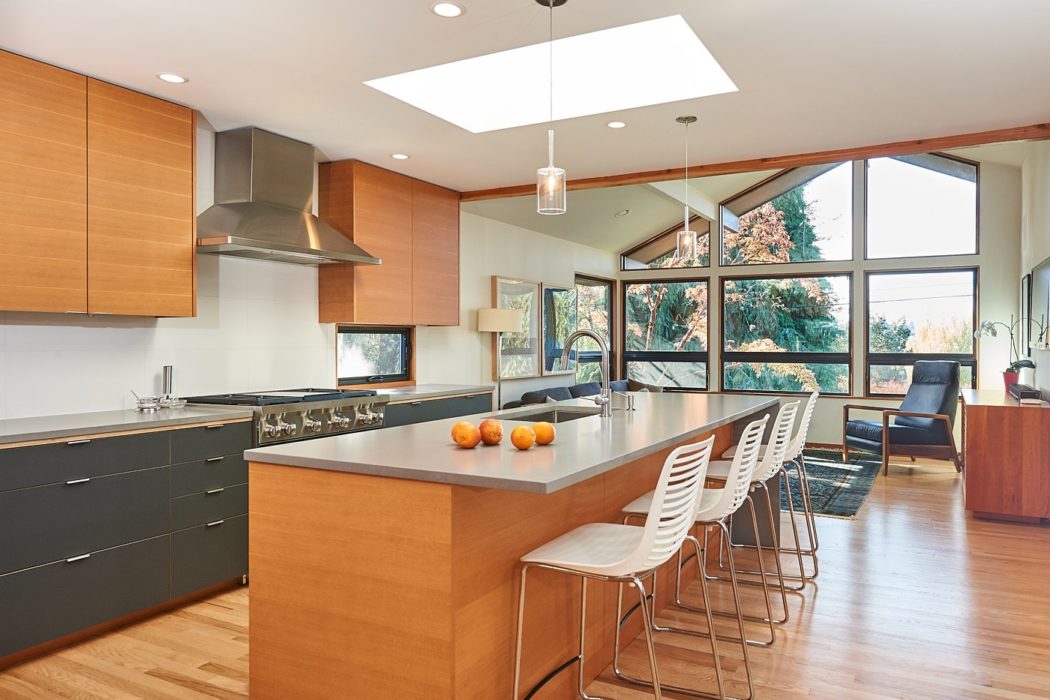
Our remodel removed many walls, eliminating hallways and creating vistas throughout the house to the outside. We removed the walls around the original central fireplace chimney, allowing the entry area to be more functional with custom built-ins and to feel more spacious.
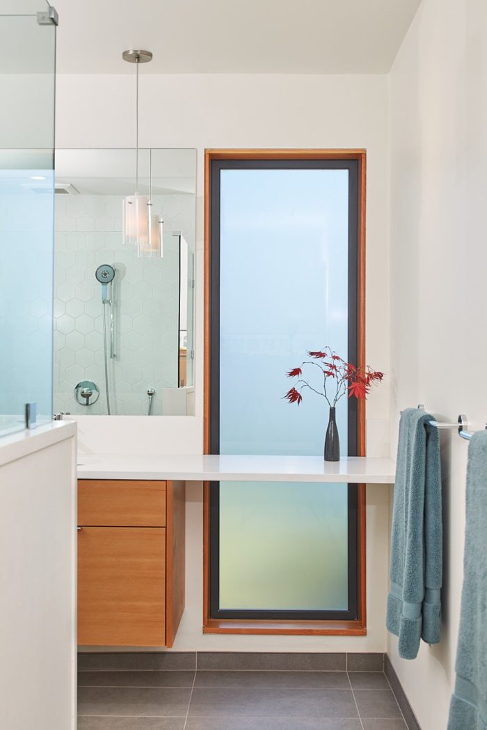
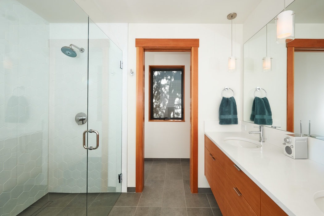
The palette of materials throughout the house is spare and limited – befitting a Mid-Century Modern remodel; however we also introduced fir trim and cabinetry in order to create a softer, warmer, more relaxed vibe. The result feels like a classic North West mid-century, especially with such great connection to the landscape outside….though with that neighborly front courtyard, this family finds itself hanging out there greeting their many friends even in our Northwest rain!
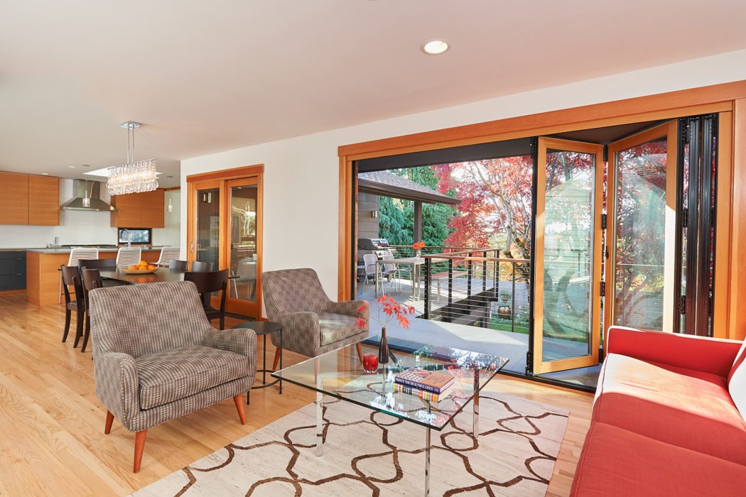
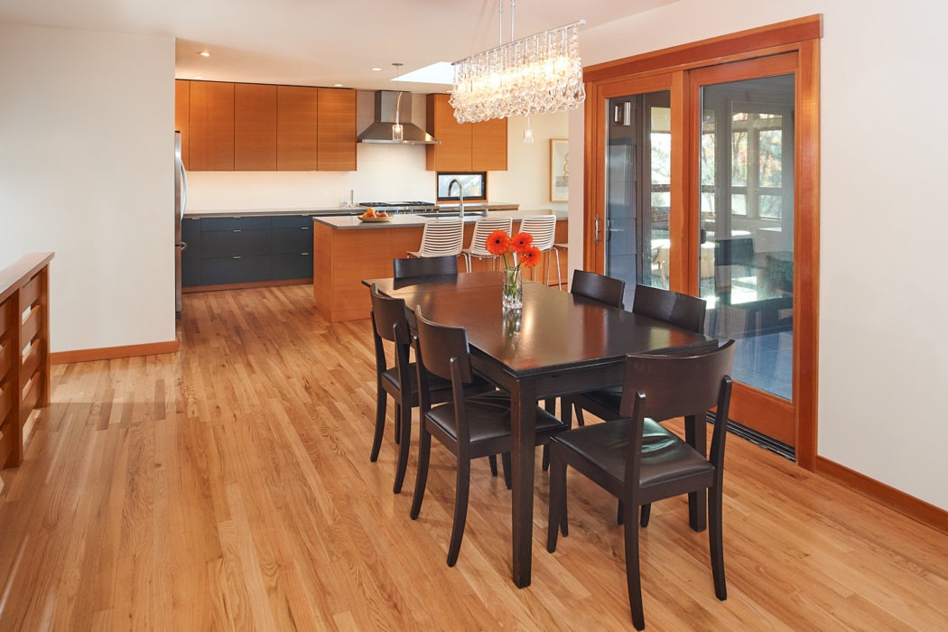
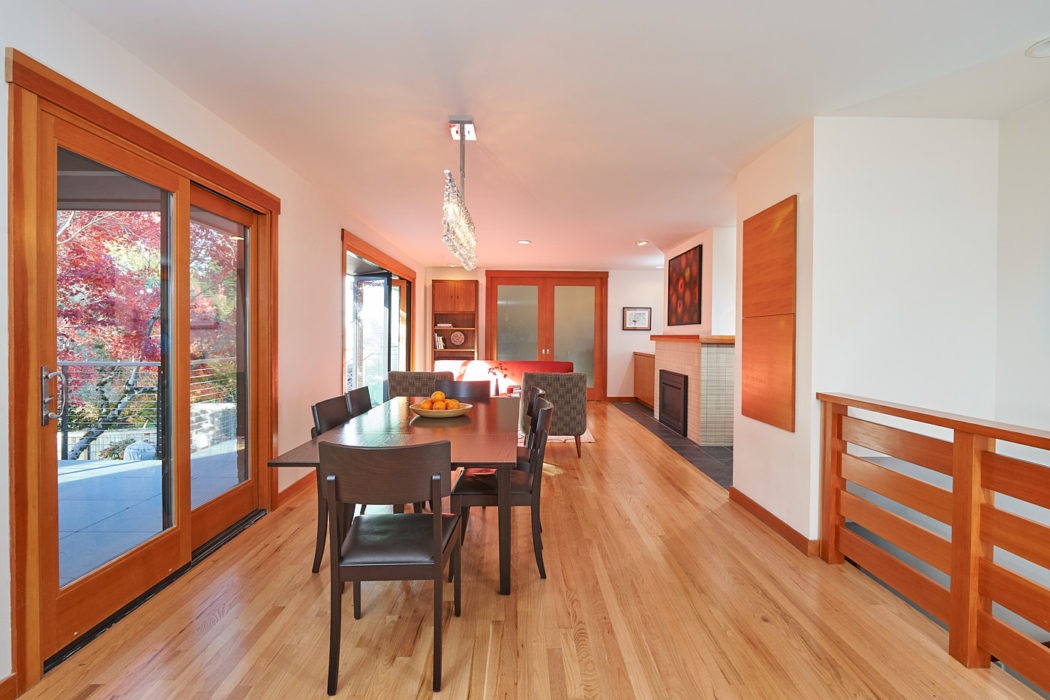
The open stairway is now visually connected with the lower level so that going downstairs doesn’t feel like leaving the main part of the house. But once in the master bedroom with its very private view to that magical tree, it feels like a private retreat!
Photos by Michael Cole
