

Home Architecture Tips: #3 in a Series of Design Tips from a Seattle Architect
During a remodel, choosing colors is usually quite a different experience than when simply decorating, or designing. Instead of focusing on a wall color from the start, we usually get pins, clippings, and general ideas to pull from which helps us narrow a palette to what makes our client feel comfortable (in their home). Usually the big decision starts out as a time of terror for our clients, but they soon realize that color is an opportunity for creativity and self-expression – in fact, one of the most fun parts of our interior design work is when the time comes to select the paint!
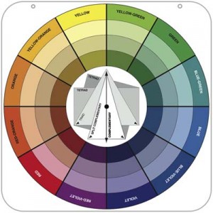
So how do you start? We suggest several criteria to consider when putting together your palette.
- First, think about how you feel comfortable
 in your home. Color has a direct affect on how you feel; it can promote calm and peace, boisterous laughter and rowdiness, restraint and orderliness, and on and on. If you want a dining room where your guests laugh a lot, stay late, and enjoy telling stories over good wine, you might lean towards brighter, bolder colors that vibrate with each other – think happy colors!
- Now think for whom, where, and the spatial composition you are designing for: bright colors for kids, bright neutrals for elderly, warm darks for large rooms to feel cozy, bright lights for small rooms to feel expansive. Also ask yourself if there is a feature piece in the room that could use an accent wall, whether a piece of artwork, TV, or other focal point. Accent colors are great for adding interest to relatively featureless rooms as well as adding a contemporary edge.
- How will each of your rooms be lit? Natural, spot,
 diffuse lighting? Depending on the temperature of the light (natural light is cool, incandescent is warm), your colors may look different on the wall than in the paint store (always swatch!) so keep that in consideration when choosing a hue. Finishes also are affected by light; while semi-gloss or eggshell is common because it can hide imperfections, other finishes can actually enhance a space. For example, gloss finishes highlight architectural features like trim or a ceiling medallion by drawing attention to them, and the more reflective a ceiling is, the more expansive it will feel.
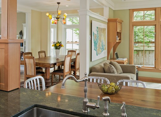
- Note which rooms are visible to each other. All the colors in the house must work together, whether they are in the same rooms or not; this creates the continuity within a home that is so important. Generally, neutrals for hallways and circulation spaces are a great choice, as they will blend and complement colors of adjacent living spaces. In a recent project, instead of using different hues for the wall colors, we used three tones of the same light grey throughout the house depending on the amount of light each room received. For the darker rooms we used a lighter tone and vice versa to achieve a seamless effect, as if all of the rooms had been painted the same color.
- Think about special objects you own and love. If you have
 an area rug you want to showcase, pick a few colors and pull your palette from it. Just recently, we had a client with beautiful ceramic tiles from her trip to Turkey. We featured these in her kitchen backsplash and used its colors to accent other areas of the house for a cohesive palette.

With all of this in mind… Here are our 4 things NOT to do when painting and building your palette.
- Don’t be afraid of color!
 While neutrals are great, bold is in style. Opt for a bold, contemporary pop of color.
 - Don’t overwhelm your space. Too much intense color can overwhelm a space. If you have several bold colors, choose one focal color and several softer hues.
- Don’t let your space fall short. Liven up your walls and if you’re painting an accent wall, make sure it is doing enough for your space to warrant the pop of color.
- Don’t avoid the time to prime your walls (and clean them if necessary). You are not only avoiding more work (and money) down the road by doing it before hand, you’re also taking care of your walls!

One last tip for color: as Seattle architects, we are very aware of the grey, diffuse quality of light. Let your interior colors be a critical tool in warming up an otherwise cool natural light, especially in your tone. For example, using a warmer white as opposed to a white with hints of grey or blue. Exercise caution in using dark, saturated colors throughout your home as they can feel oppressive quite quickly. Happy painting!
Categories:
Categories:
Tags: